
Toronto RehabAnnual Report
Medium: Print, Web
For their 2011 Annual Report, Toronto Rehab had two distinct needs. The first was to create a bright and lively presentation that highlighted many years of past successes. The second was to produce a layout flexible enough to go from print to web, permitting them to swap out static images for video clips at the beginning of each section.
Copy deck changes were an ongoing struggle to visual flow. This was solved by adding call-out text from key statements in the body.
High quality images were in short supply, so for some portions I supplied photographic services.
The colour scheme is rather interesting in how it worked out. Toronto Rehab's corporate colours are green and blue, yet they wanted a lively interior. After reviewing various print materials produced in the past, there was a multi-colour poster that wound up serving as inspiration. As the last section deals with financial and statistical data, we return again to the green and blue to close out the document.
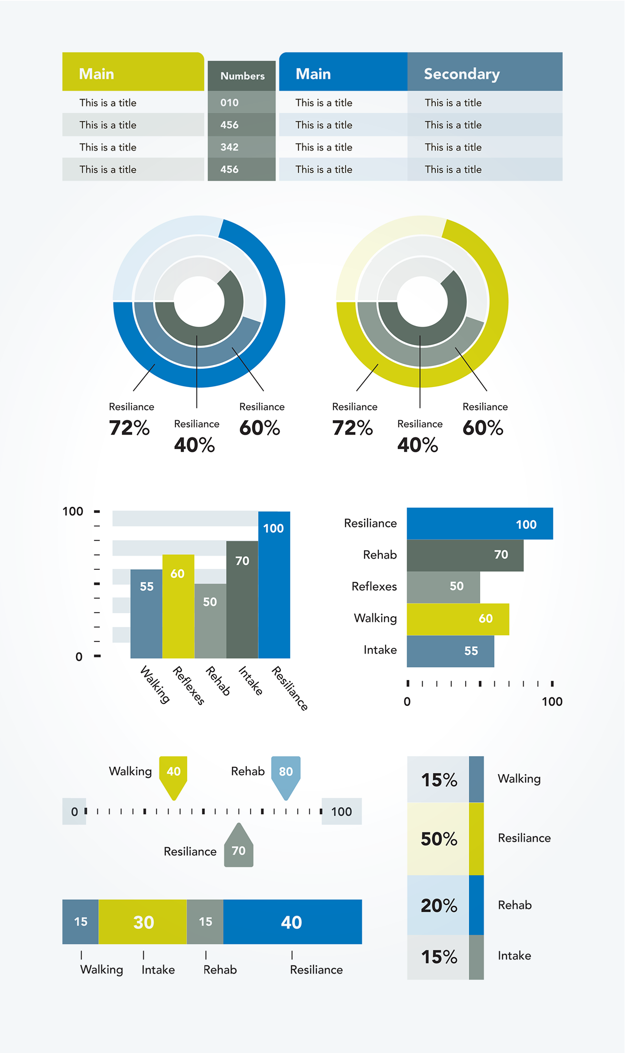
Infographics in the closing section went through several stages of investigation to determine the easiest methods of communicating the data. Several mock-ups are included (last graphic).
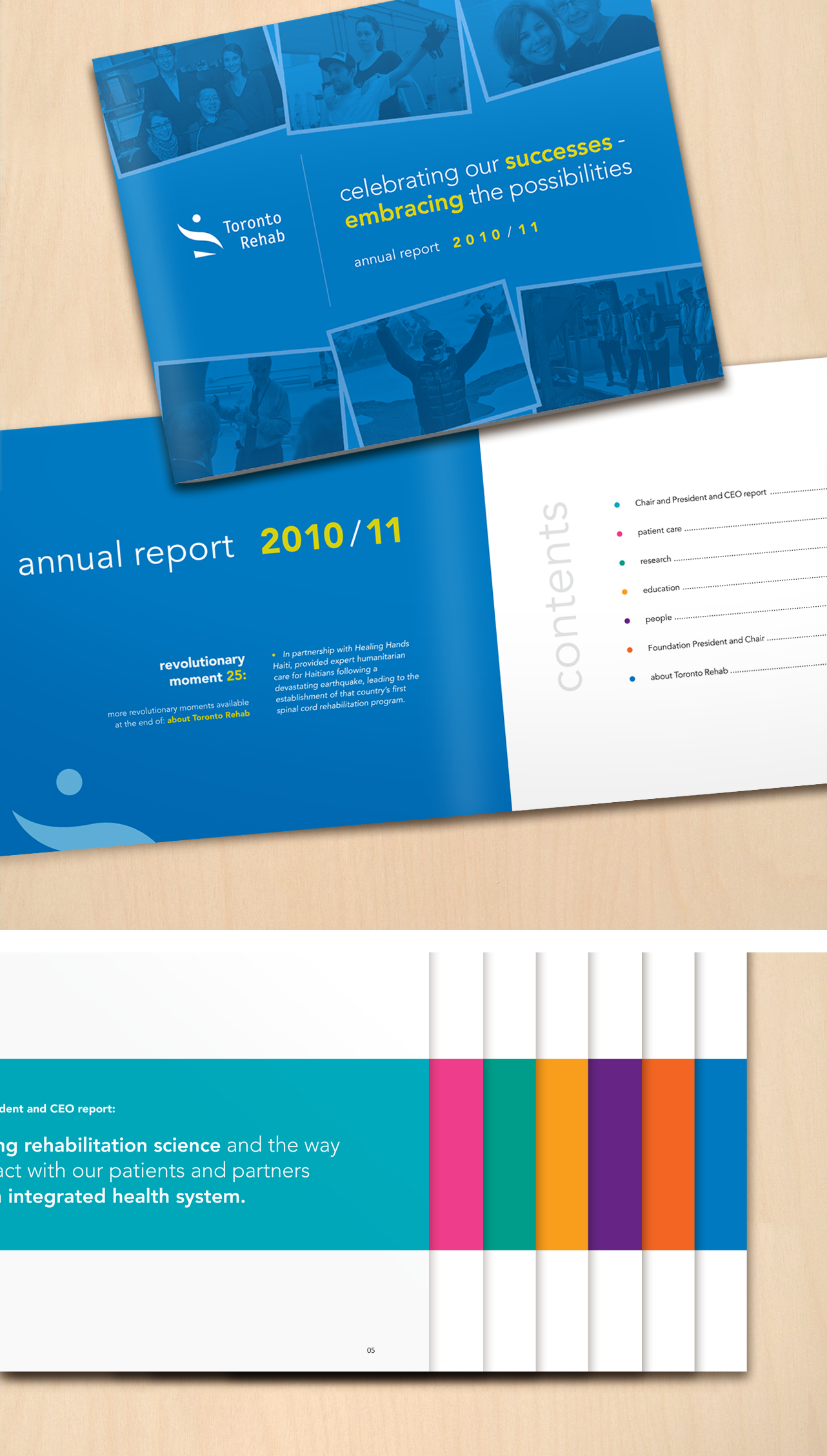
Cover and contents, featuring 7 sections
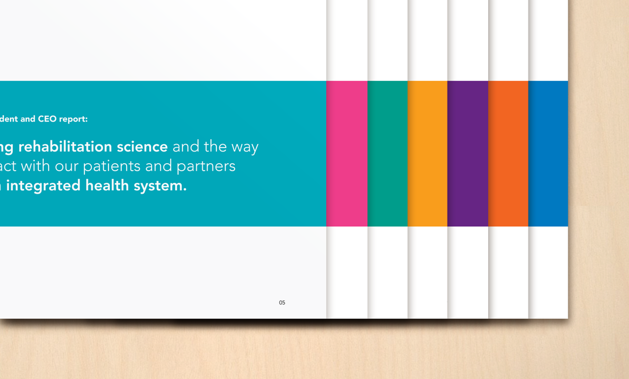
First section overview

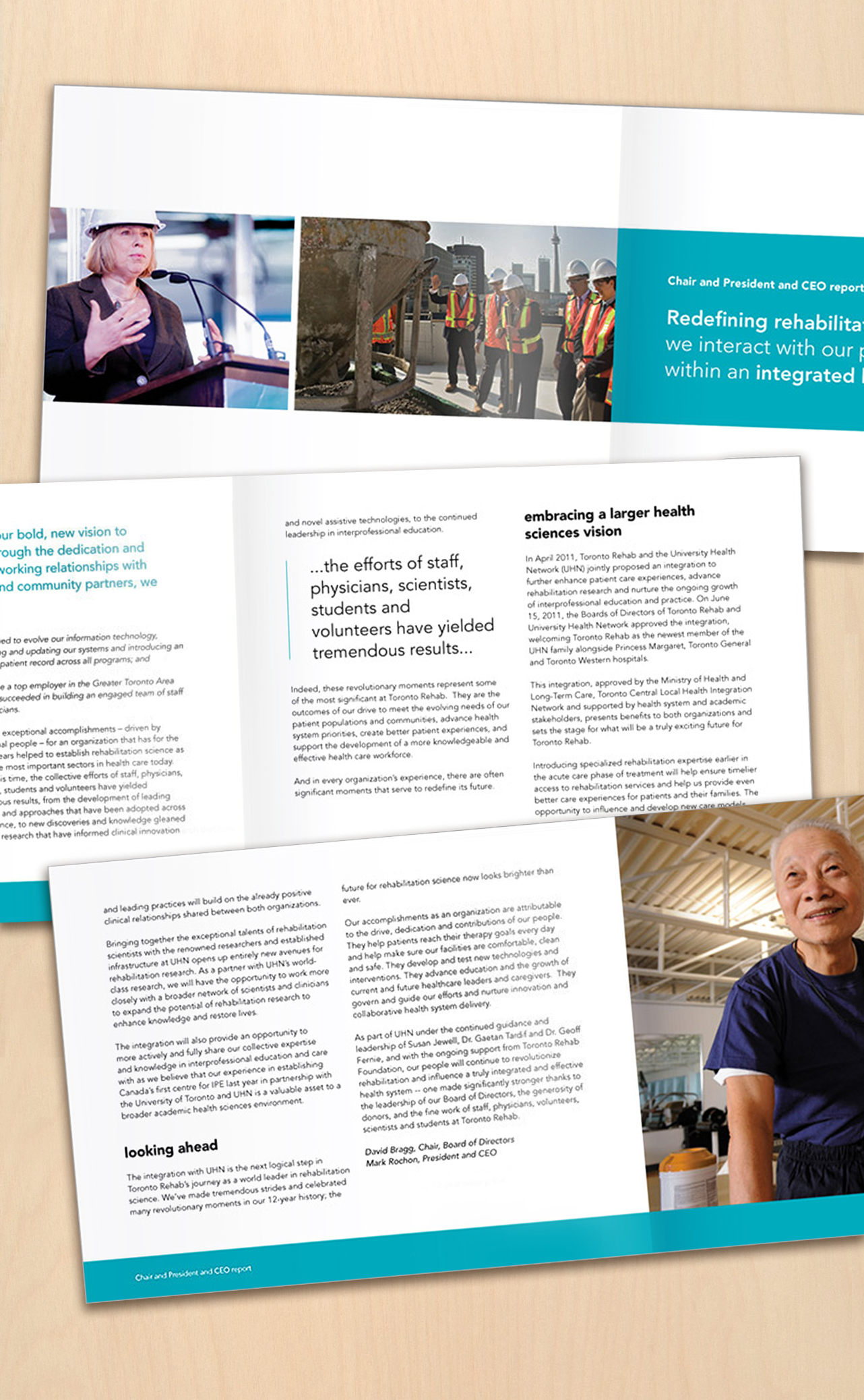
All section openers designed for web-based video presentation
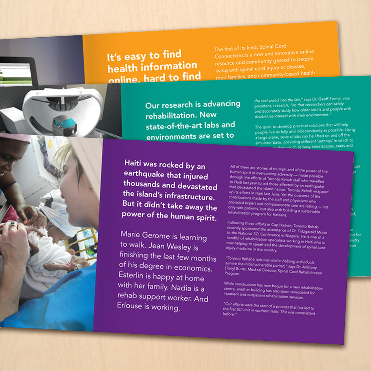
Several sections close with a large, featured story
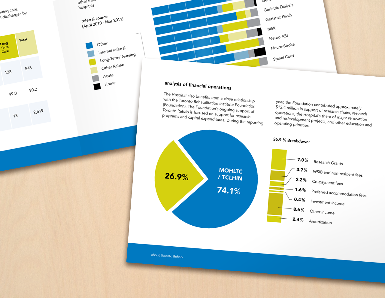
Financial graphics that help to close out the annual report
Early charts and graphs visual exploratory (dummy stat data)

Toronto RehabAnnual Report
Medium: Print, Web
For their 2011 Annual Report, Toronto Rehab had two distinct needs. The first was to create a bright and lively presentation that highlighted many years of past successes. The second was to produce a layout flexible enough to go from print to web, permitting them to swap out static images for video clips at the beginning of each section.
Copy deck changes were an ongoing struggle to visual flow. This was solved by adding call-out text from key statements in the body.
High quality images were in short supply, so for some portions I supplied photographic services.
The colour scheme is rather interesting in how it worked out. Toronto Rehab's corporate colours are green and blue, yet they wanted a lively interior. After reviewing various print materials produced in the past, there was a multi-colour poster that wound up serving as inspiration. As the last section deals with financial and statistical data, we return again to the green and blue to close out the document.
Infographics in the closing section went through several stages of investigation to determine the easiest methods of communicating the data. Several mock-ups are included (last graphic).
Cover and contents, featuring 7 sections
First section overview
All section openers designed for web-based video presentation
Several sections close with a large, featured story
Financial graphics that help to close out the annual report
Early charts and graphs visual exploratory (dummy stat data)