
BlackberryBB10 In-app Icons
Medium: Mobile
From March 2012 to the BB10 launch in 2013, I was part of the in-app icon design team at RIM (now BlackBerry). I later led the team, and together we created over 1,500 icons for dozens of core apps.
In-App Icons In-app icons, unlike application icons, are designed to be simple, bold, and neutral. This ensures readability without distracting from the page content. We also created color versions for use in Help and Settings menus, sometimes applying color psychology. We also produced additional sizes beyond the core set.
Third-Party Icons For third-party icons, we adapted the style by adjusting line thickness and gradients to better align with each brand's original aesthetic.
Emoticons I also contributed to the design and update of BB10 emoticons. My role was to double the number of emoticons from the previous BB7 set for the 2013 update.
Note: All visuals are the property of BlackBerry. Thanks to Anton, Dusan, Elaine, Joel, Per, Przemek, Vlad, and others for their visual groundwork.
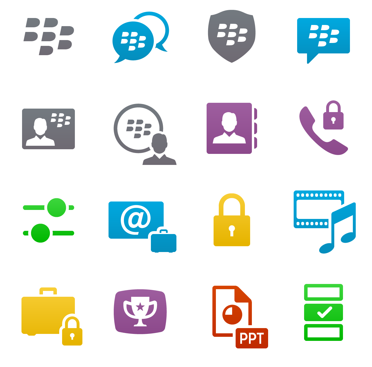
Cross Cut and Action Bar (bottom bar) icons
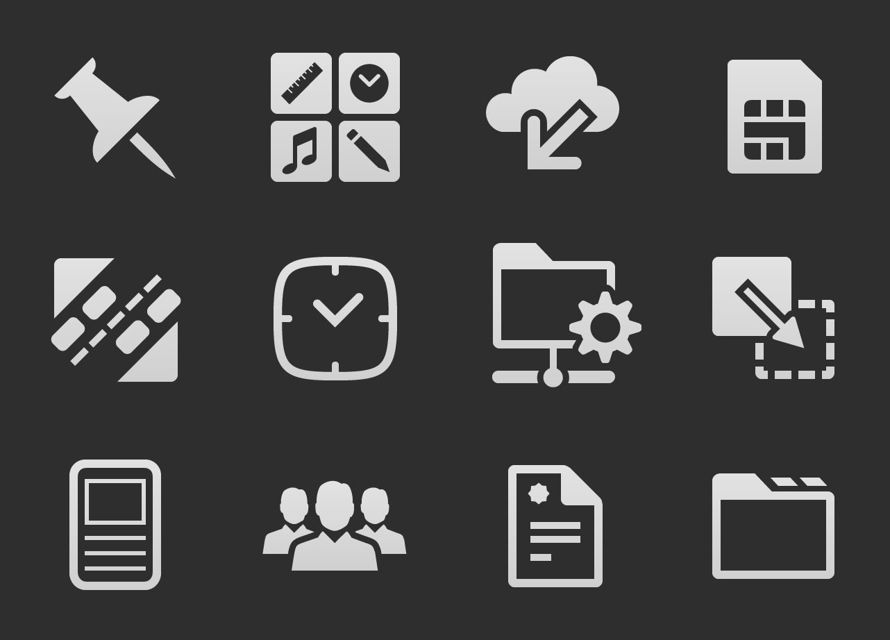
System icons
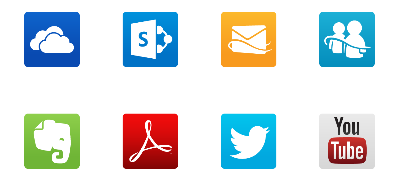
3rd Party; bridging the new BB style with their own
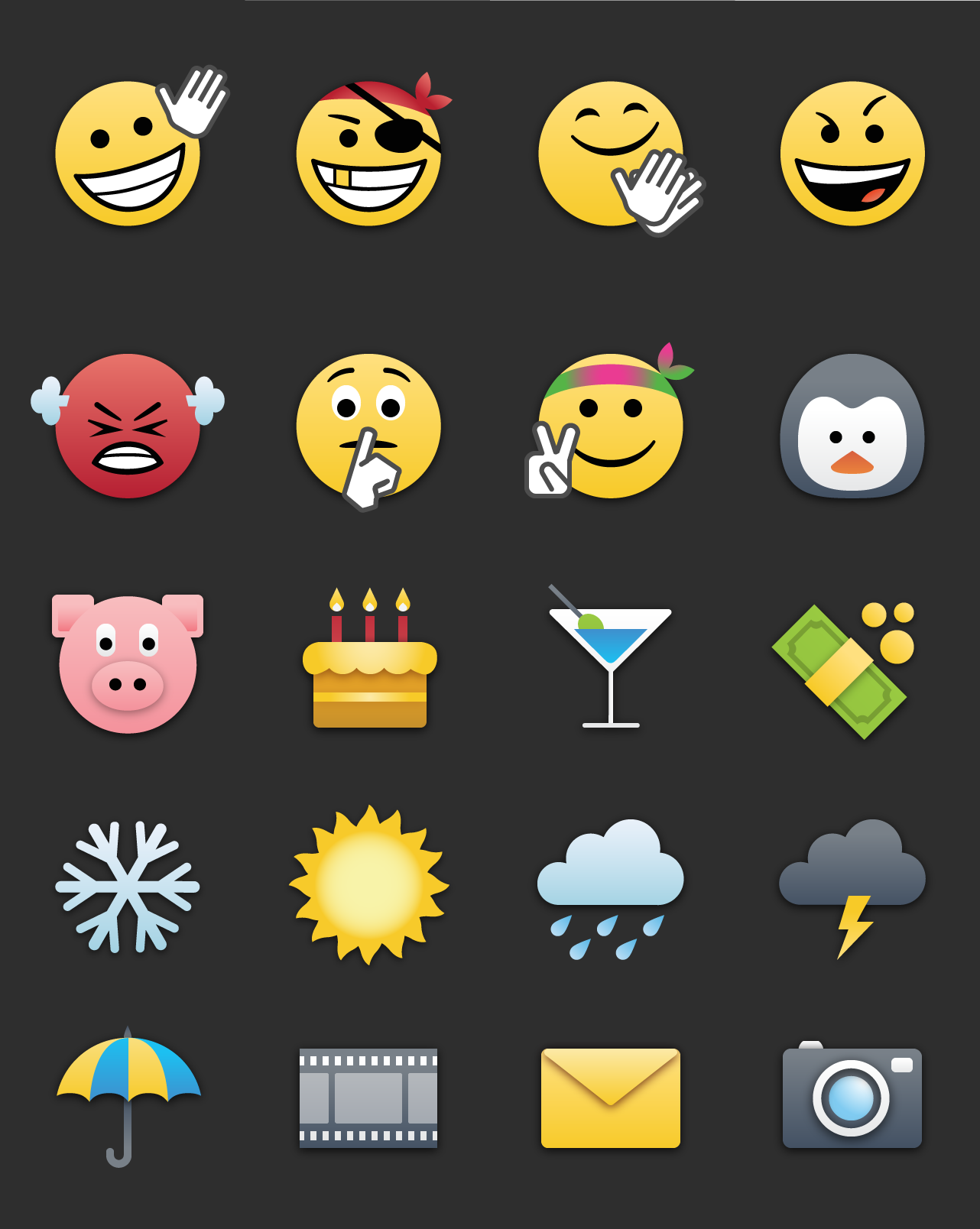
Emoticons, personally designed, from a much larger set of about 50

BlackberryBB10 In-app Icons
Medium: Mobile
From March 2012 to the BB10 launch in 2013, I was part of the in-app icon design team at RIM (now BlackBerry). I later led the team, and together we created over 1,500 icons for dozens of core apps.
In-App Icons In-app icons, unlike application icons, are designed to be simple, bold, and neutral. This ensures readability without distracting from the page content. We also created color versions for use in Help and Settings menus, sometimes applying color psychology. We also produced additional sizes beyond the core set.
Third-Party Icons For third-party icons, we adapted the style by adjusting line thickness and gradients to better align with each brand's original aesthetic.
Emoticons I also contributed to the design and update of BB10 emoticons. My role was to double the number of emoticons from the previous BB7 set for the 2013 update.
Note: All visuals are the property of BlackBerry. Thanks to Anton, Dusan, Elaine, Joel, Per, Przemek, Vlad, and others for their visual groundwork.
Cross Cut and Action Bar (bottom bar) icons
System icons
3rd Party; bridging the new BB style with their own
Emoticons, personally designed, from a much larger set of about 50